college sauce
project type
Ux/Ui, Branding
year
Winter 2024 – Summer 2025
role
team
2 Leads, 4 Designers
project overview
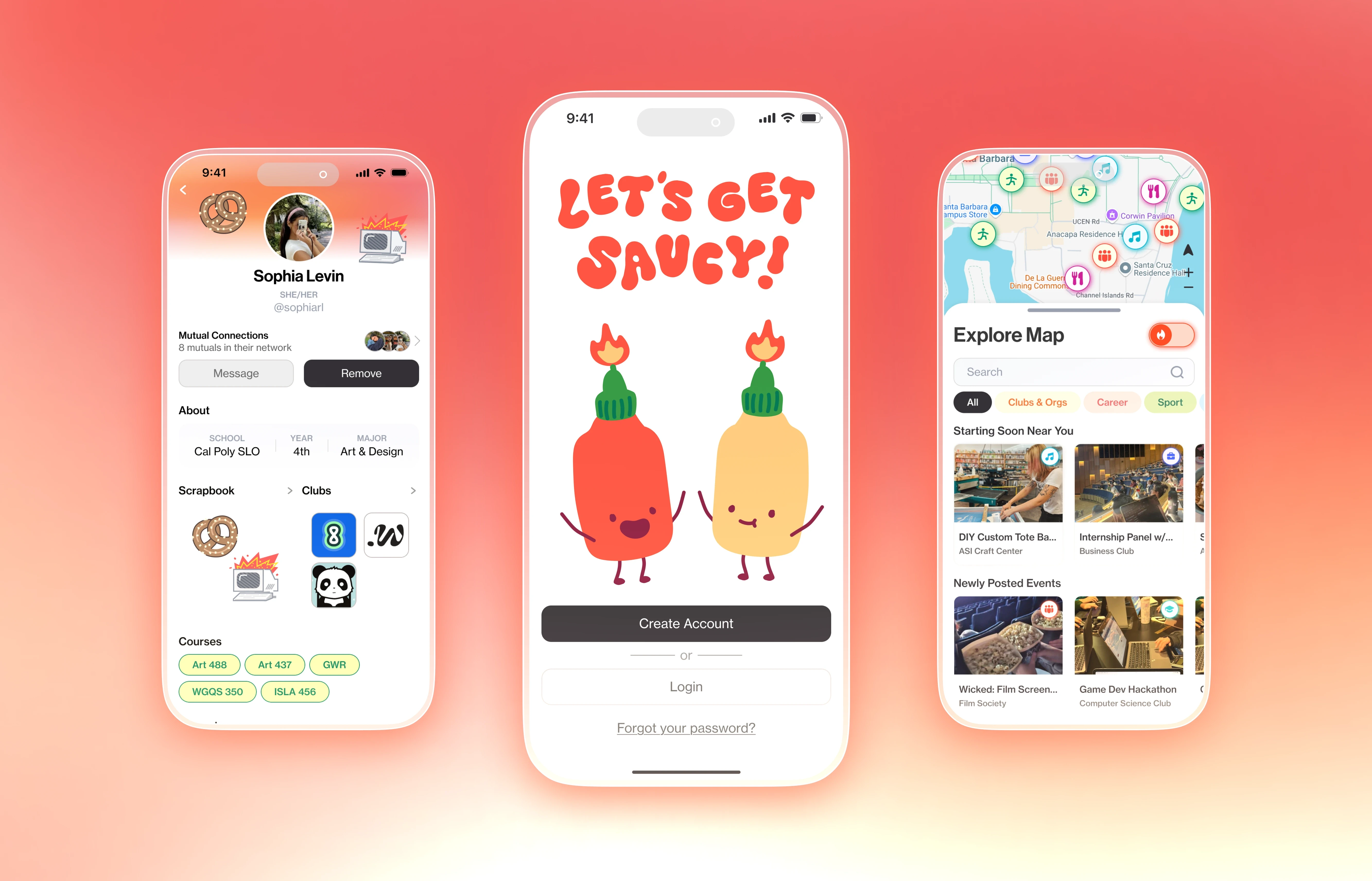
College Sauce is a campus events app that helps students discover what's happening nearby, create their own events, and connect through group chats.
I co-led design with Maxine Ancheta across a team of six over a 10-week sprint. I designed the notification page, vibe check feature and the onboarding flow, built the event tag system, and directed the mascot system.
quick links
Our team

Sophia Levin
Product Design Lead
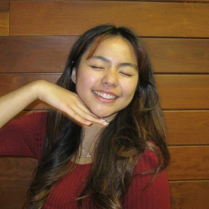
Maxine Ancheta
Product Design Lead
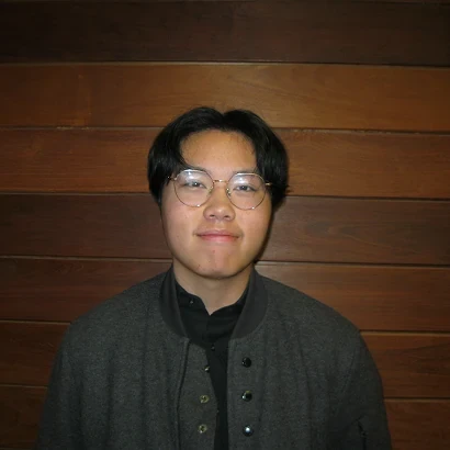
Edrick Wong
Product Designer
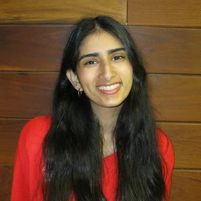
Subha Eranki
Product Designer
Pavani Balaji
Product Designer
Xouxa Latendresse
Product Designer
In partnership with College Sauce's founder, Sarah Boggs.
project outcomes
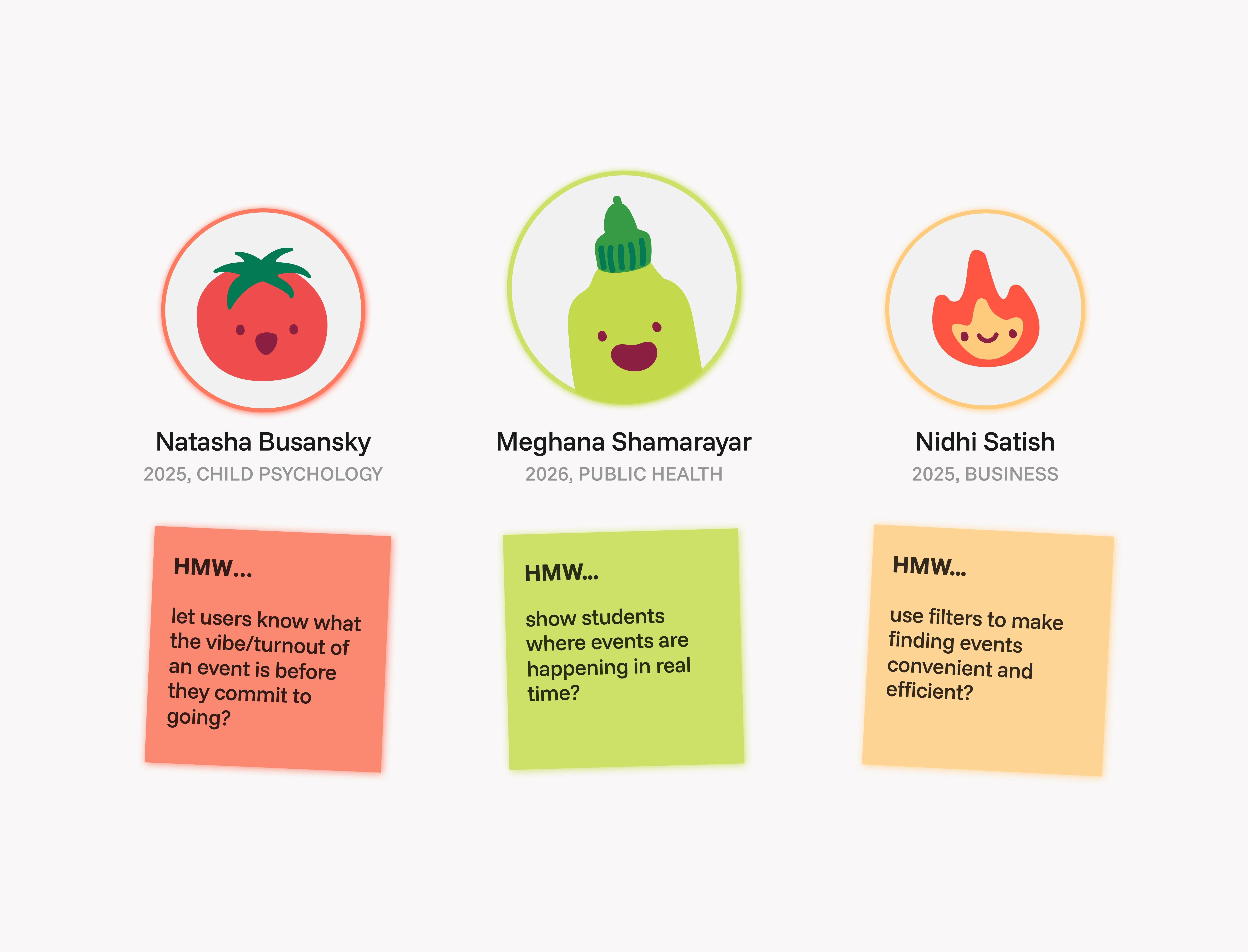
46 surveys, 11 user interviews
conducted across college students

fresh brand identity
logo, mascot, color system, design system
7 features prototyped
40 screens audited
what is college sauce?
College Sauce 1.0 was built by UCSB students as a community hub for social events, one place to find everything happening on campus.
01
Find events
02
Post your own
03
Connect
our process
How we worked
I built the FigJam workflow, Maxine built Notion, and together we ran each week's exercises so all six of us could work in parallel and build on each other's thinking.

5 weeks in figjam
Audits, affinity maps, moodboards, problem statements, interviews, personas, user flows, Crazy 8's, and screen assignments week by week.
problem statement
Unclear navigation and dead group chats prevented students from engaging. How might we improve event discovery and interaction so students can connect and participate?
Maxine and I each drafted our own problem statement, swapped them, and refined until the whole team agreed.
the problem
No one asked the students
Sarah Boggs came to Cal Poly Iter8 with three problems: nobody was posting events, group chats died within a day, and her team was uploading content by hand to keep the app looking alive.
Before we designed anything, we audited all 40 screens in the existing app.
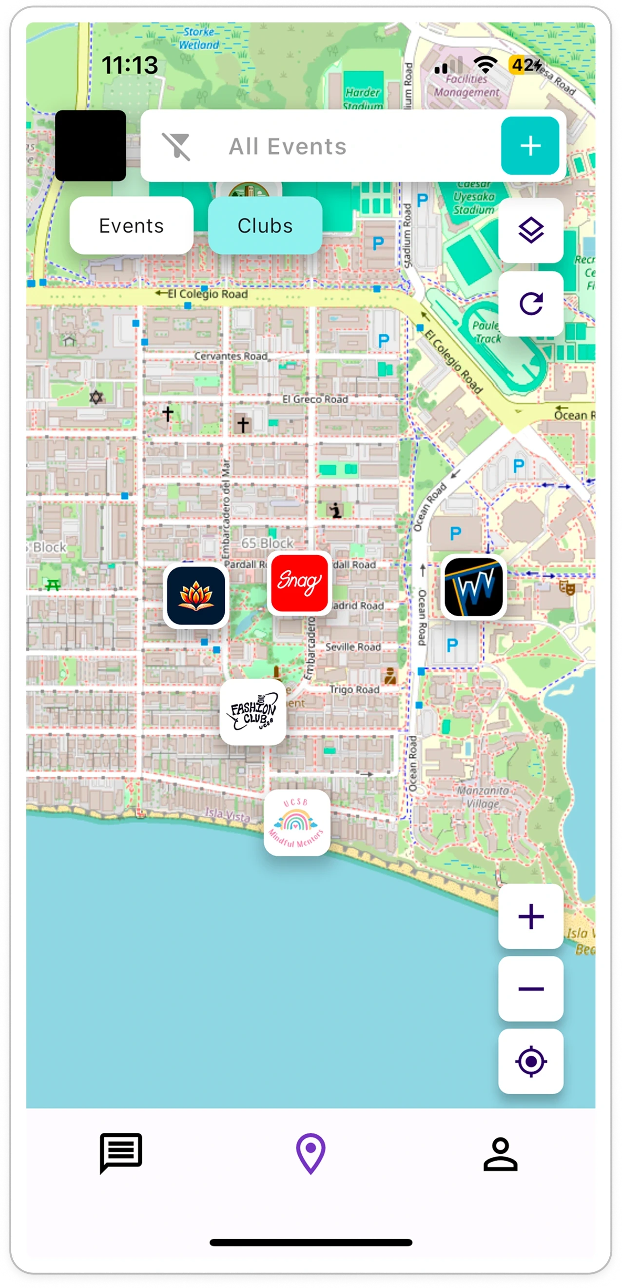
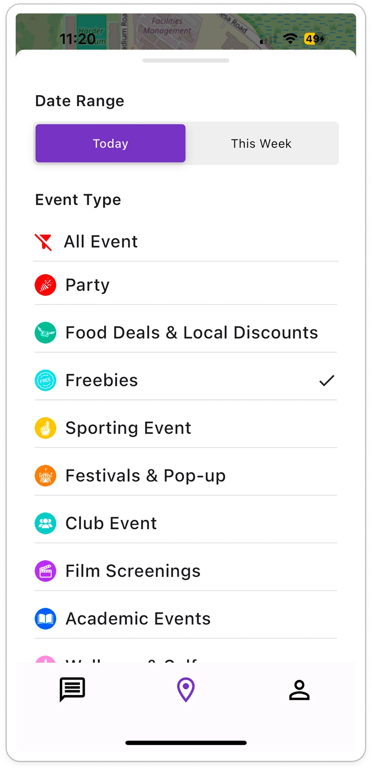
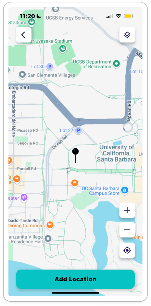
The original College Sauce UI before our redesign.
map
One of the four pins here is a paid ad and the rest are clubs. Click the map to reveal which. Filtering was limited to Today and This Week. In addition, selecting one event type closed the panel, so users could not multi-filter.

post event
Setting a location meant dropping a pin instead of typing an address; the field filled with raw coordinates. The form also had no photo, one tag, and no way to mark an event as recurring, the one function clubs meeting weekly needed most.
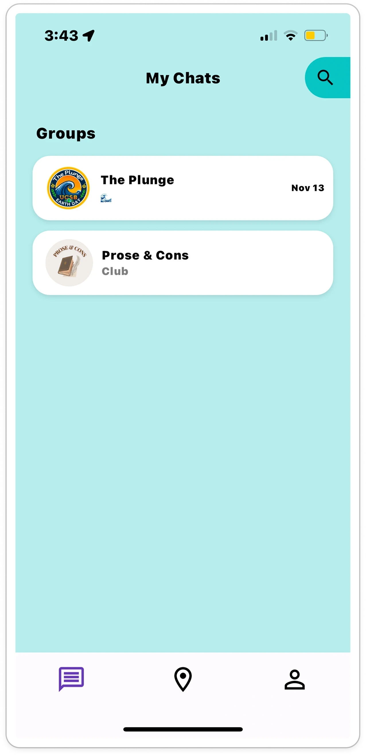

group chats
Two chats, no previews, no member counts. No way to tell if anything was happening inside. Open a group chat and there was a text field and a keyboard. No reactions, no way to see who else was in the club. Students joined and left.
research
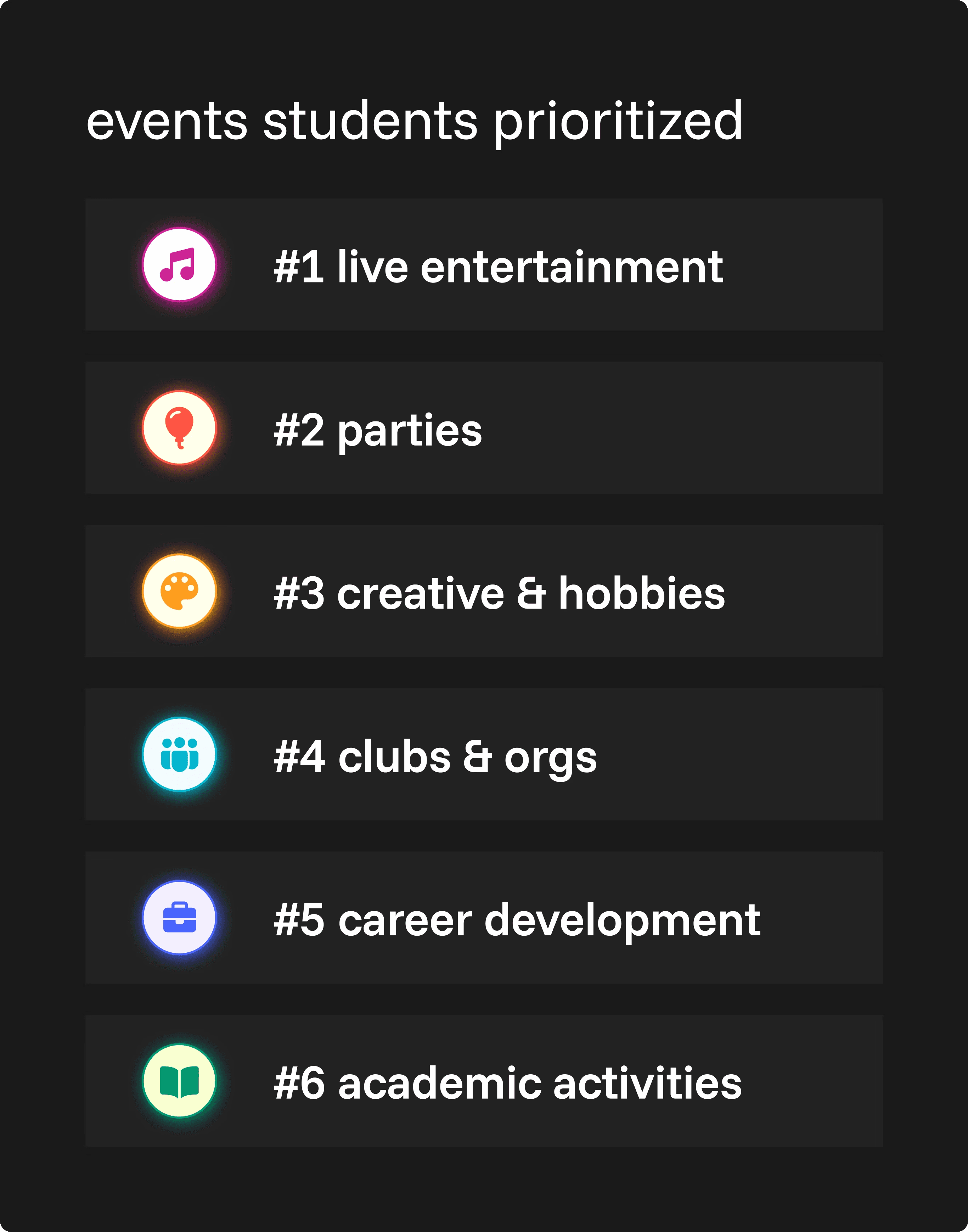
We surveyed 46 students, interviewed 11 one-on-one, and audited 15+ competitor apps to understand how students find out about events, decide whether to go, and connect afterward.
survey findings
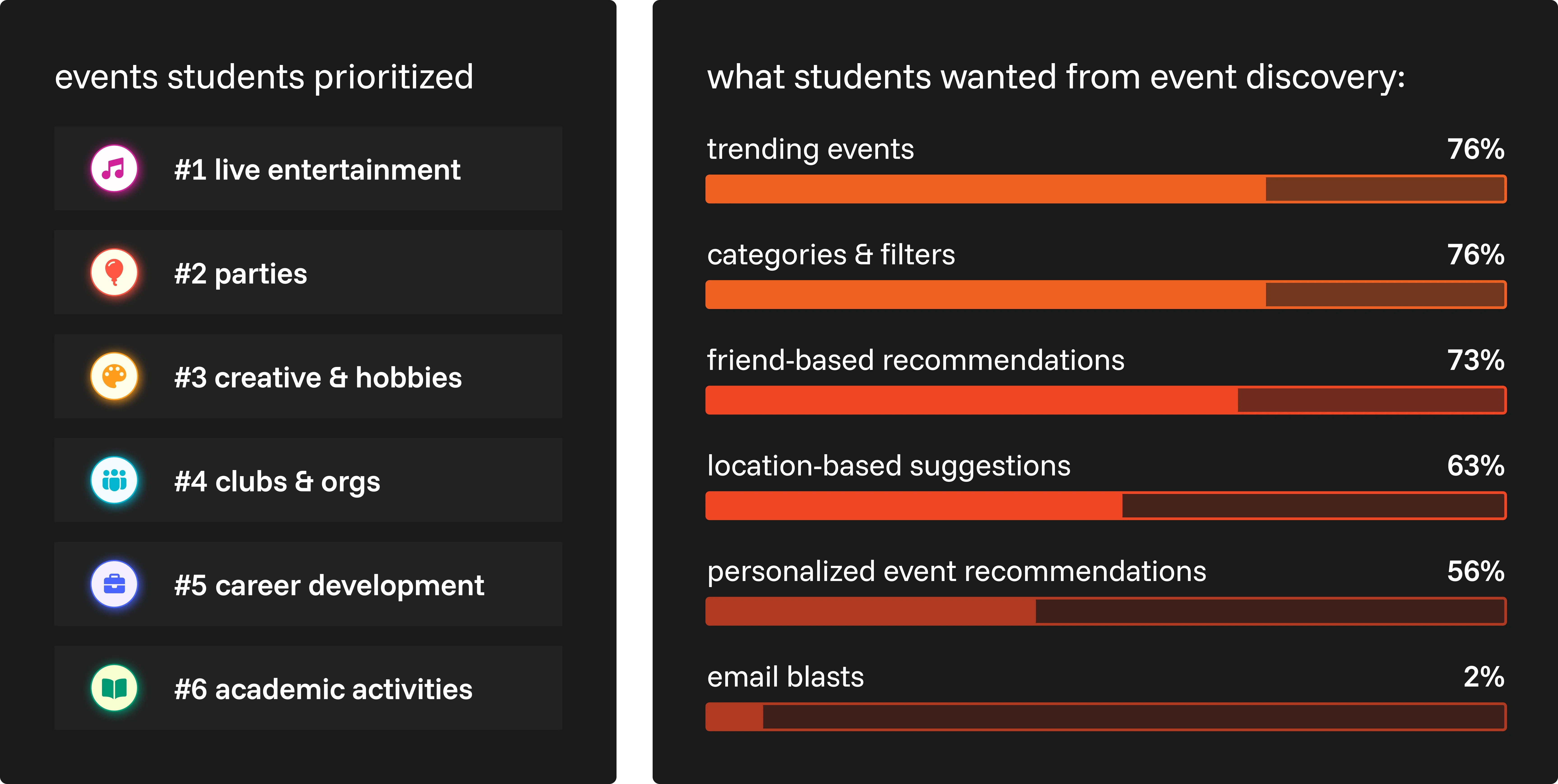
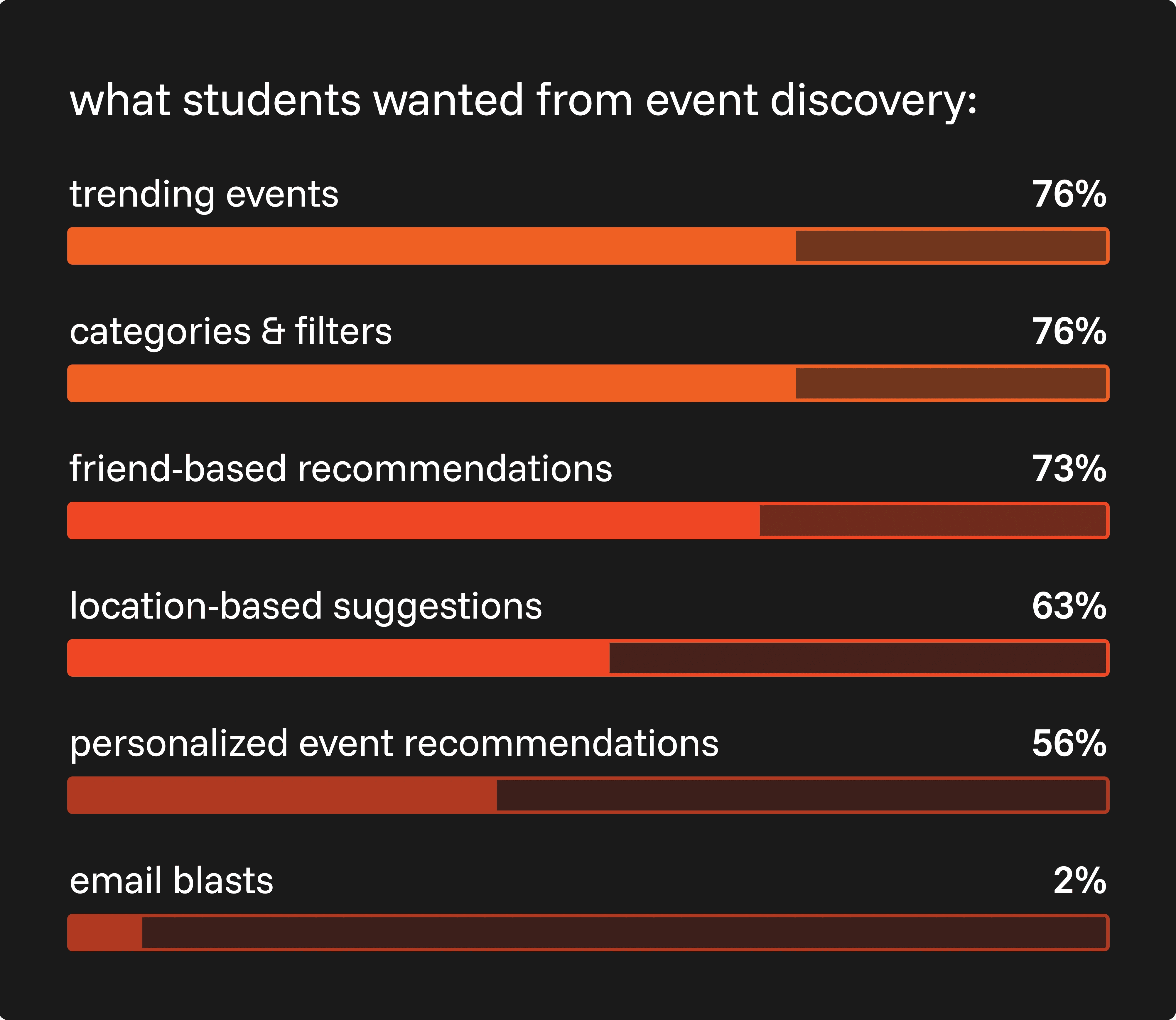
Students didn't care as much about the event itself as they did about who else was going. Trending indicators and filters tied at the top, 76% each, and friend-based recommendations came close behind at 73%.
interview findings
Once the interviews surfaced what students needed, we built it into the app, not as separate features, but woven into flows they already use.
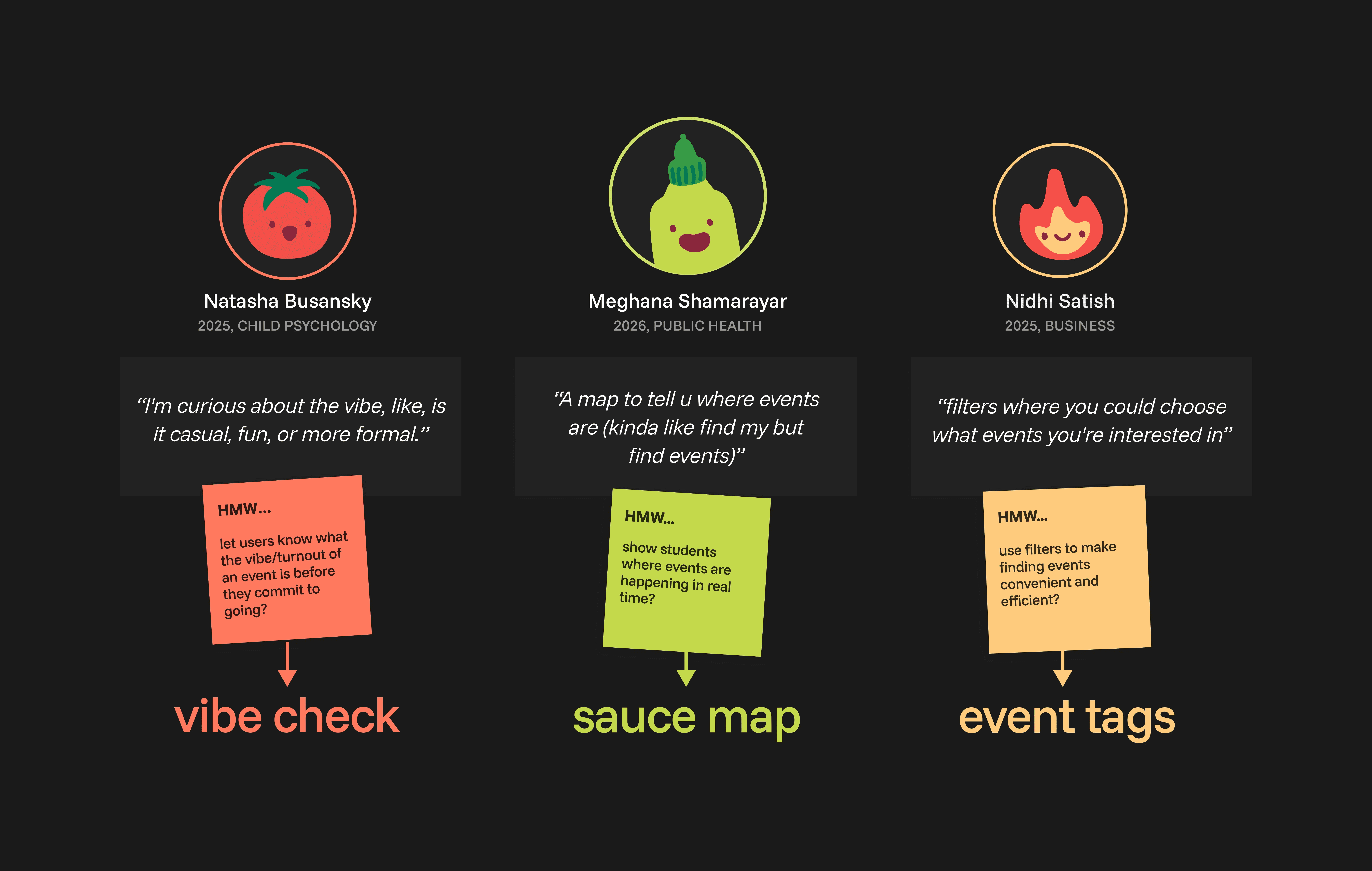
Students told us they wanted to try new events, but often didn't. Attending events posed a risk, no one wanted to gamble on a Friday night.
scoping the redesign
3 features research led us to build
Beyond Sarah's original three problems, research surfaced two more: whether a night was worth the risk, and how to juggle rides and photos across separate apps. Three features came out of solving them.
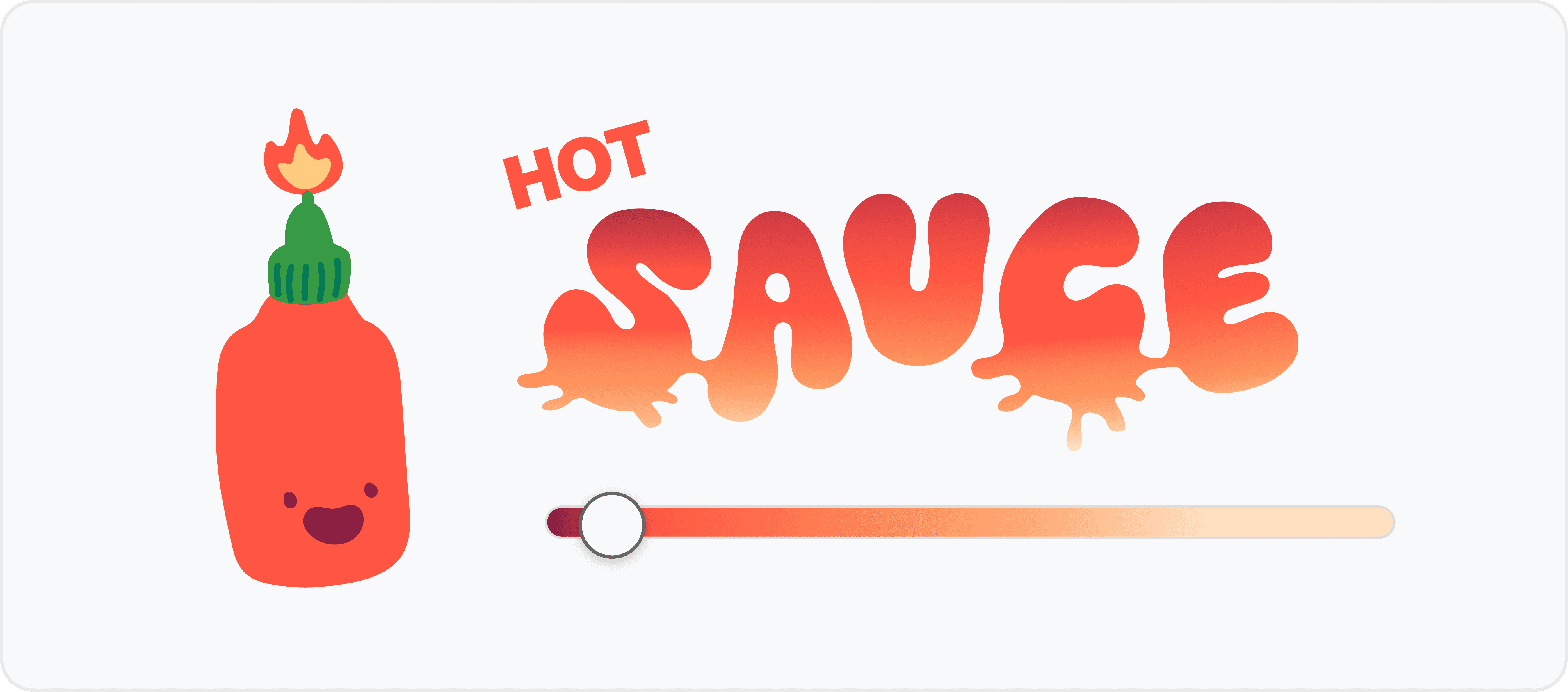
Attendees rate the vibe live, so anyone still deciding can preview turnout first.

Each event comes with a group chat for sharing photos, plus a collectible sticker for your profile.

A live layer shows which parts of campus are actually busy.

the deliverables
Text and color styles, components, and prototyped flows, packaged and prepped for the client hand-off.
the fix
Seven features, one map-first experience
onboarding
I designed the onboarding flow to collect students' interests and clubs upfront, so the explore map they land on is already filtered to what they actually care about.
loading animation by Edrick Wong
explore map
Inspired by Apple Maps, we built a pull-up card system with search, filters, and list view, with color-coded tags to narrow by event type.
sauce map
Toggling the sauce map adds a live density layer, so students can see where people actually are, not just where events are listed.
event posting
Clubs can now set events to repeat, cutting down on reposting every week. Tags support multiple categories and accessibility filters, so students can filter more precisely. Venue photos, co-hosts, and invite-only or public settings give hosts control over who sees what.
notifications
Event updates, friend requests, and vibe checks used to scatter across texts, emails, and app notifications. We pulled them into one feed, so nothing gets buried.
group chats
Keeping up with a club meant checking Instagram, WhatsApp, and Slack all at once. Now every club, event, or Friday night plan gets its own group chat.
vibe check
Students rate the vibe in real time, so anyone still deciding can see turnout and energy right on the event card.
scrapbook
Photos from an event land in the group chat's shared album instead of scattered across a group text thread. Attendees who show up earn that event's sticker, added to their profile.

the college sauce identity
A saucy brand system
The original brand was outdated, so we redesigned it. Every designer gathered visual inspiration across type, color, and UI. We dot voted, then refined it into the final identity.
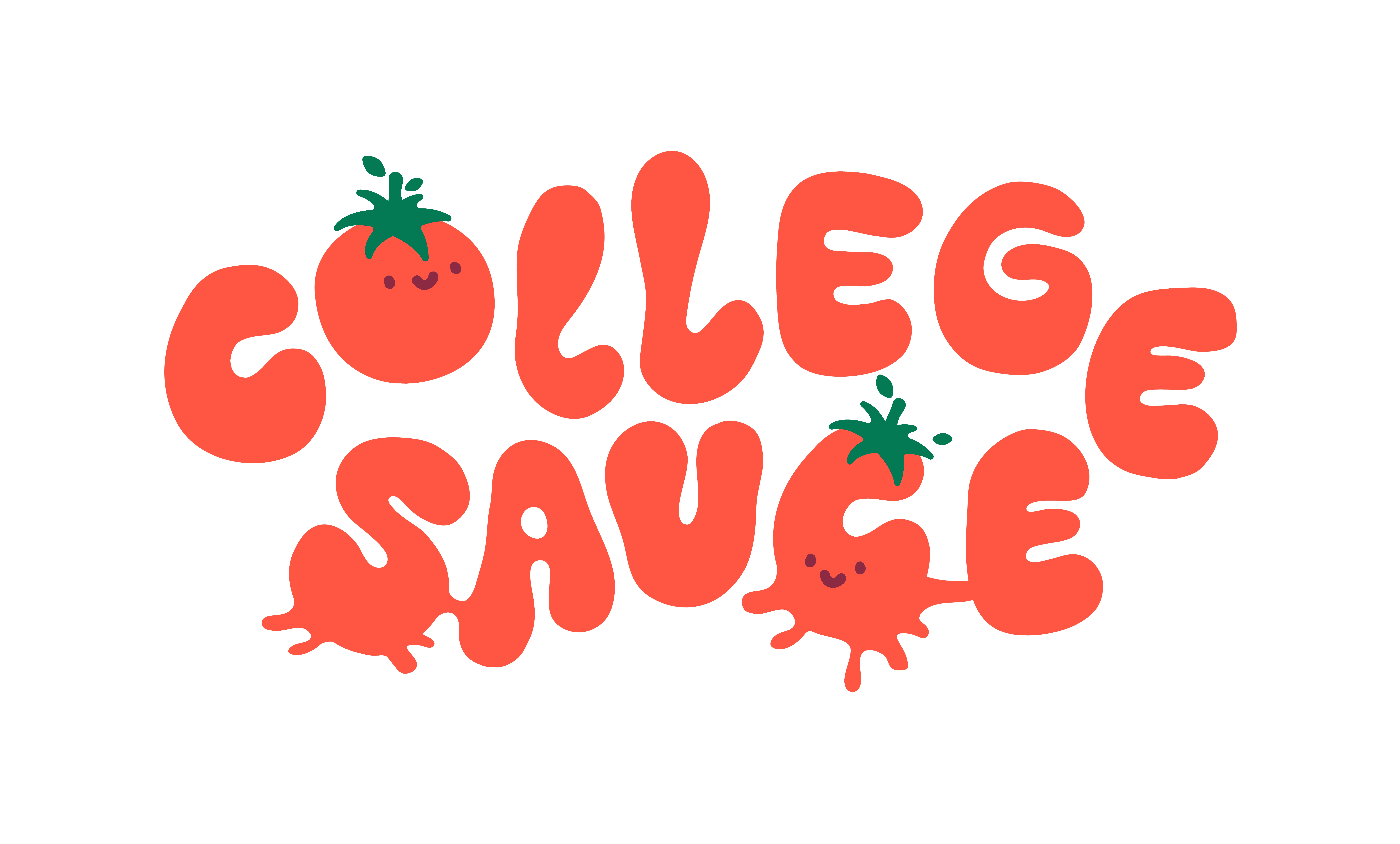
the logotype
Altered letterforms from the Baking Sauce typeface, tomato as an easter egg
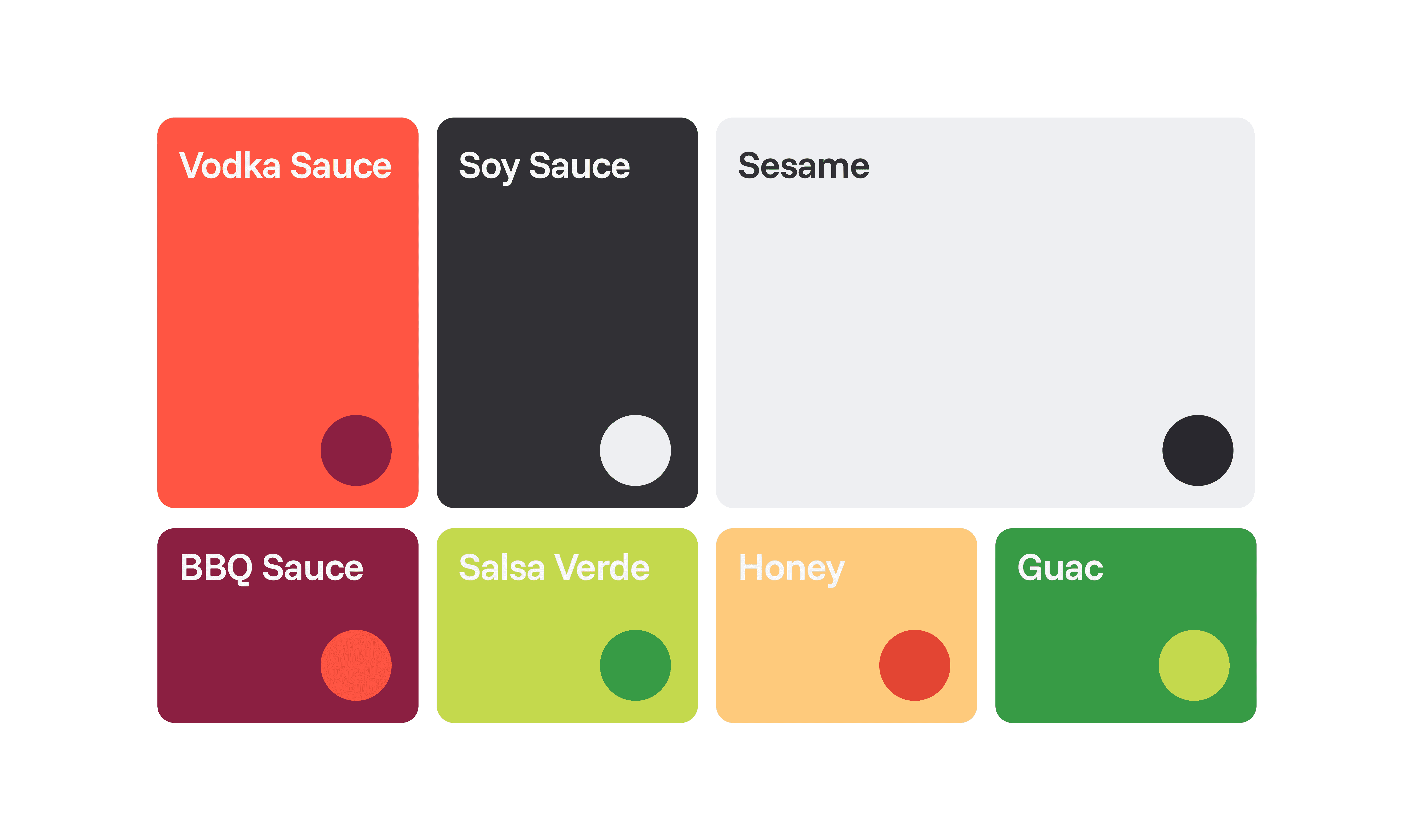
the sauces
Somewhere in the process we started naming every color to honor our favorite sauces.
the cast
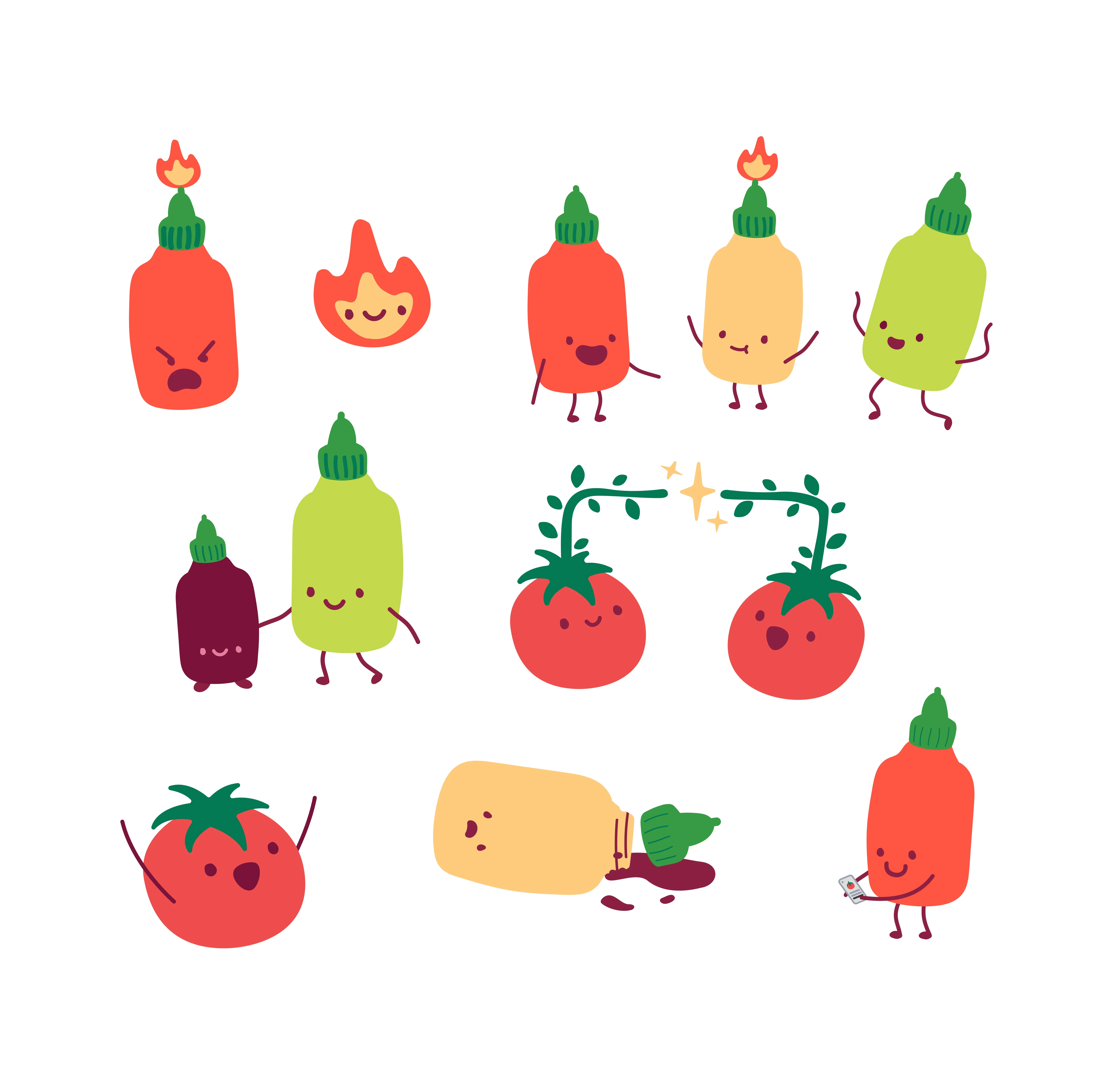
Pavani drew the original tomato. I expanded it into the full family, angry, happy, and sad states, plus functional characters tied to features, keeping line weight and proportions consistent so the cast reads as one cohesive family.
event tags
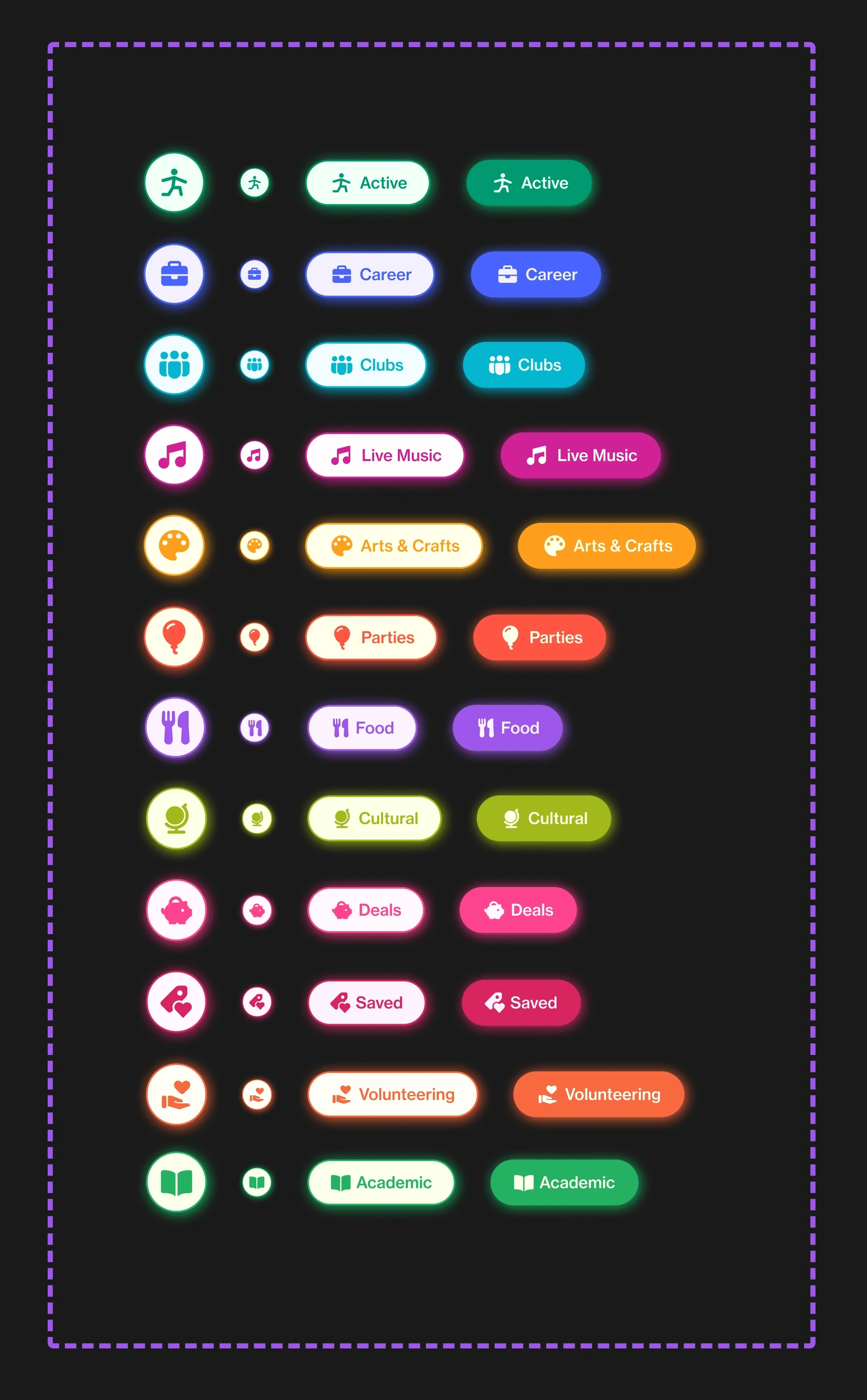
I led the event tag redesign, extending the palette into 12 categories so students can read what's happening on the map before opening a single event.
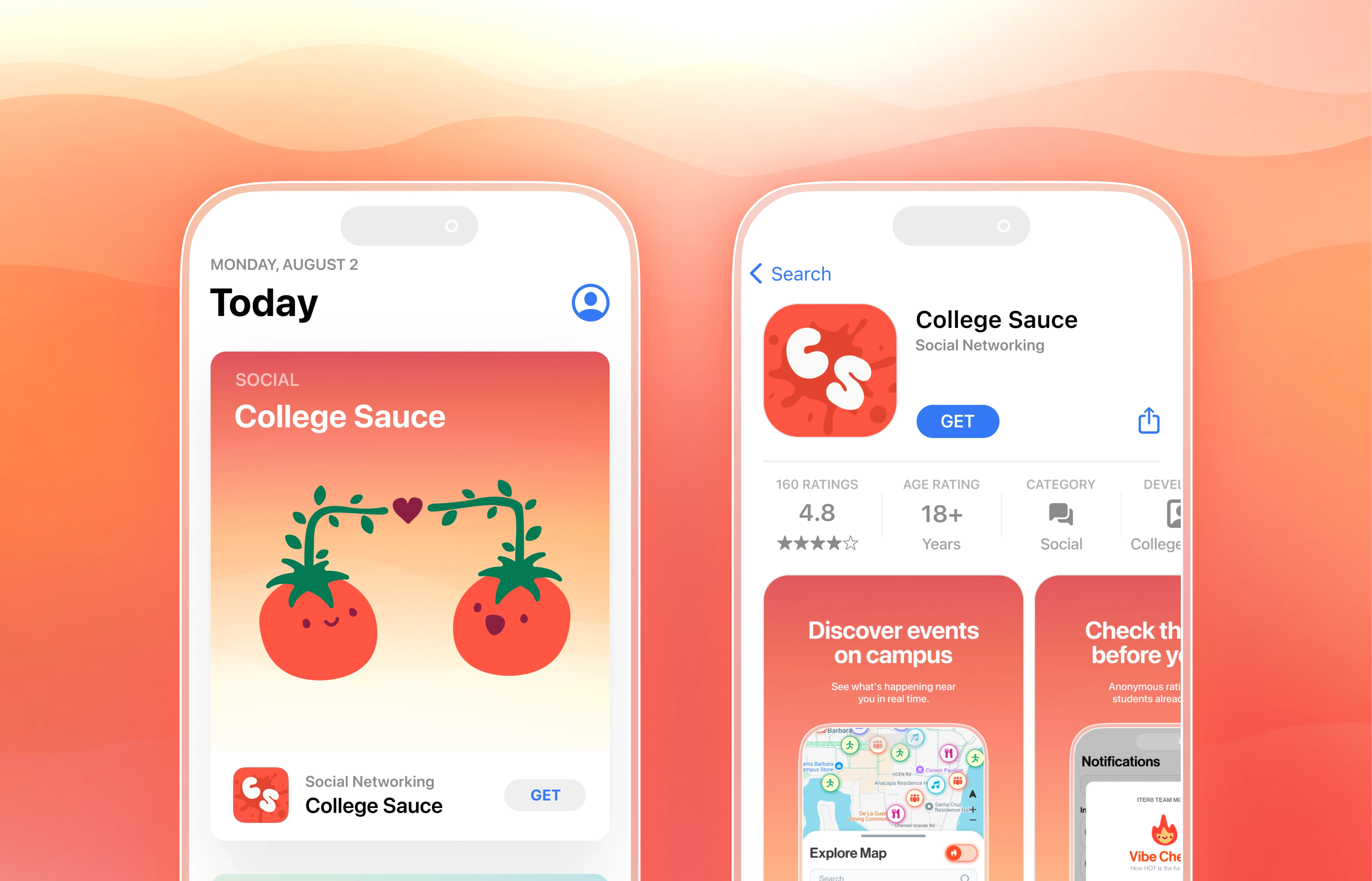
app store mockup
A concept for how the brand could look in the App Store. Sarah's planning to update the real screenshots to match.
reflection
The one call I'd revisit
Our research kept pointing at the same thing: students wanted to know where the energy was immediately. We built the sauce map as something students switch on, but that's exactly the information that should be default, not something they have to remember exists. If I redesigned it today, the density layer would just be the map.
client testimonial

Sarah Boggs
"As someone with no training in design, I came to Iter8 expecting the team would spruce up our initial designs and make our app pretty. Oh how I underestimated the impact Maxine and Sophia would have on my product."
"They took complex and sometimes disjointed ideas that I could only express in words and made them into something real."
special thanks to
The friends along the way
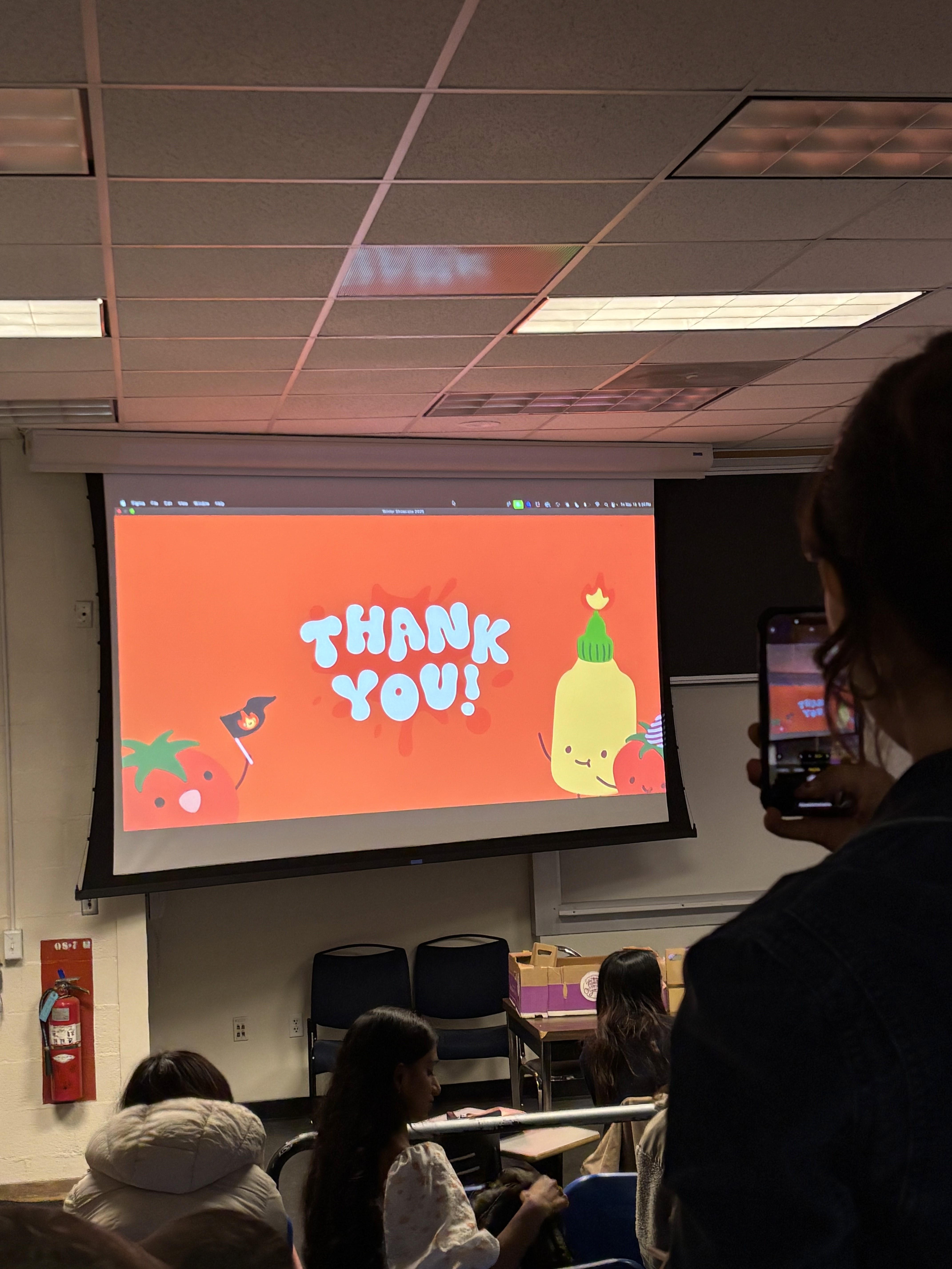
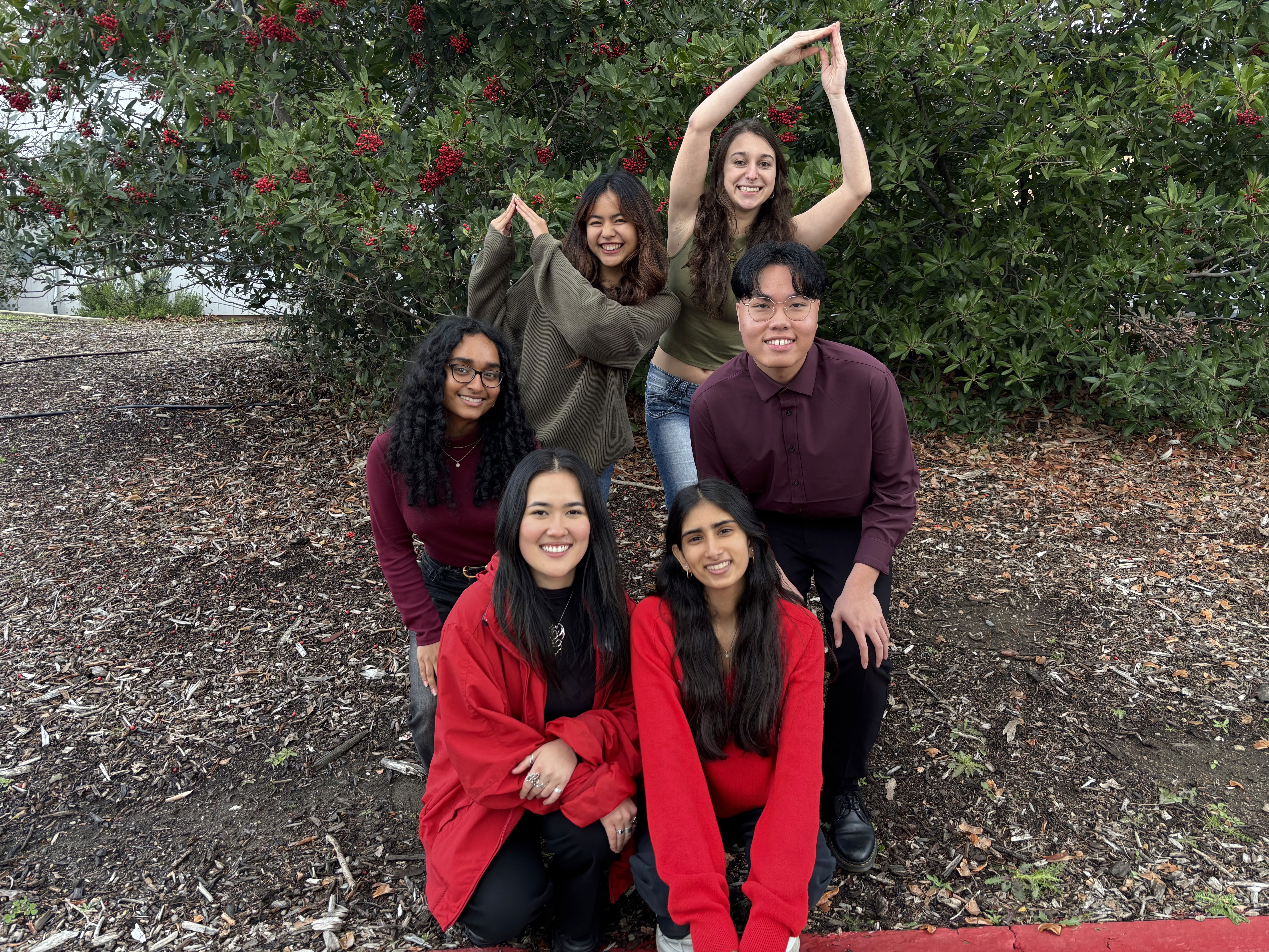
Special thanks to the College Sauce team: my co-lead Maxine Ancheta, and Xouxa Latendresse, Edrick Wong, Subha Eranki, and Pavani Balaji, who showed up twice a week and brought the energy. Spotify jams, and dressing as a tomato for the showcase, Maxine and I in green as the stem (see image below). I'm so thankful for this team and the friendships that outlasted the scope.